SMASH HAMMER
Smash Hammer is a 3D Action Game developed in Unity, focused on intense action and movement where you fling yourself the level and into foes with the force from your giant hammer!
Responsibilities for the project included:
-
Character Controller and Enemy Design
-
In Engine Prototyping
-
Tutorial Level Design
-
All VFX Creation and Implementation
-
Player Attack Animation Clean Up
-
Design Documentation for Gameplay and Level Design
-
Quality Assurance and Playtesting
This project was developed over 8 months, with a team of 12, plus some freelance assistance. I also worked as a Level Designer, a Programmer, as the VFX artist, and on animation clean up.
SYSTEM DESIGN
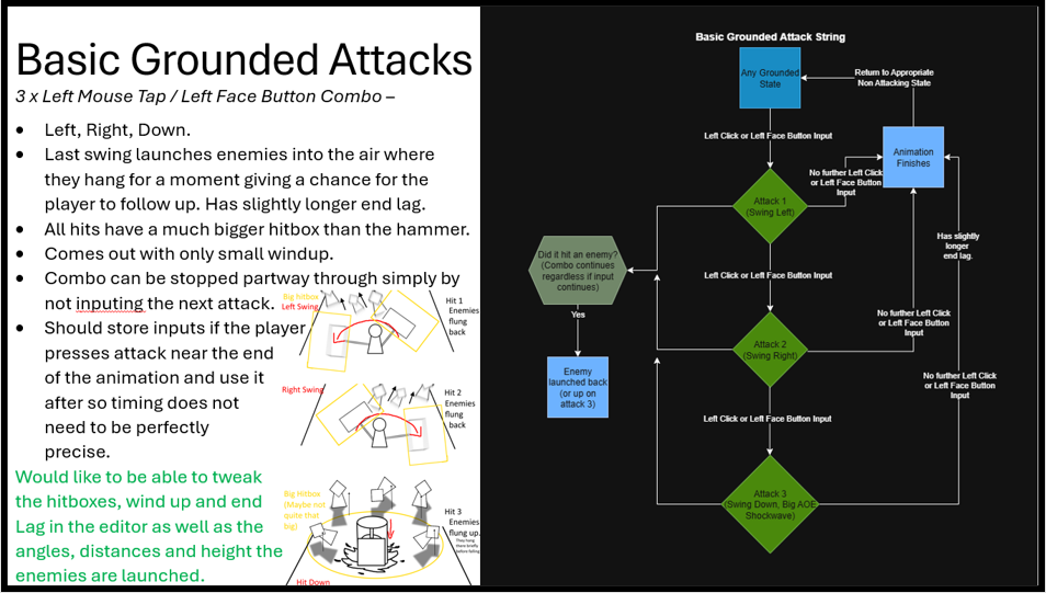
All design documentation I made featured the following:
-
A written description.
-
Notes on what features designers should be able to control from the editor.
-
One or more labelled diagrams.
-
A flow chart showing how states and actions lead into each other.
These evolved and improved over time based on feedback from programmers and artists. The image below shows a page from an early design document and details how the basic attack system could work.
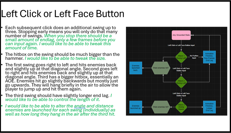
This next page is an example of how the format changed over time based on feedback. The flow charts were differently coloured for clarity and the editable features are clarified during the relevant text rather than at the end.
(There was also a diagram, it was just on the next page for space reasons).
This page also considers the basic attack, and how it's combo system works, as well as concepts for things such as knockback and hitbox sizes.
When collaborating on the enemies, a different programmer asked that I include changeable features on their own separate page, so that they could build a universal enemy base suitable to all of our needs.
In this way, some design documents varied as different formats were used based on the needs at the time.

This diagram illustrated a scrapped feature in which enemy knockback varied based on proximity.
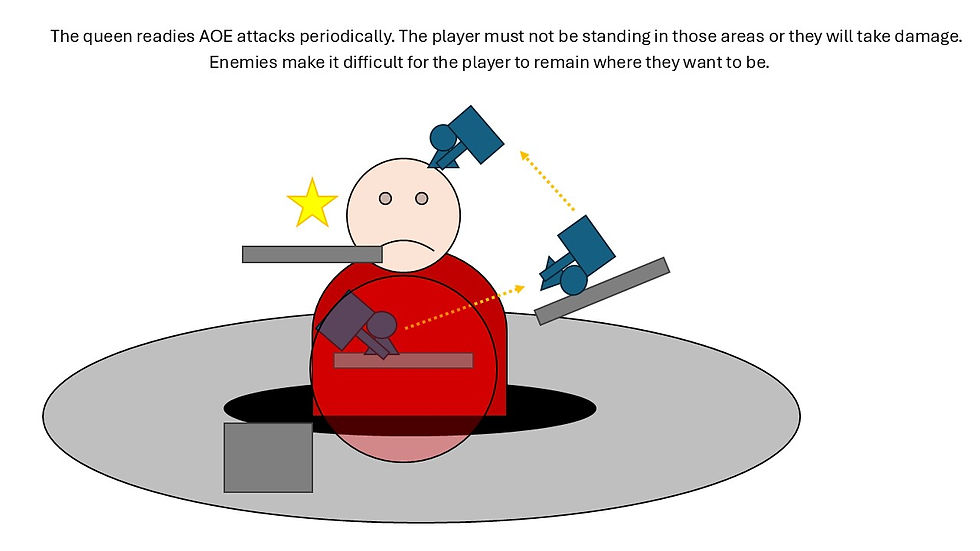
A simplistic art style was used with basic shapes and colours that help to communicate how things are related. A more formal style was not used, as this was merely a concept, which allowed for much quicker iteration on ideas, and ease of understanding for team mates.


This mechanic, determining how enemies share information with each other was more complicated so required a more detailed explanation to go along with the diagram.
Using arrows, colours and labels means that although reading the paragraph is needed the first time, the diagram can be used as a reference to remind someone who has already read the text how the mechanic works, at a glance.
Much of the design documentation was produced in collaboration with the programmers, with the intent being that they could use it to implement features as quickly as possible. Our process was that they would create the raw functionality and would hand it back to the designers, largely myself, with as many variables as possible to refine it into the intended playable experience.
As part of this process a structure was largely followed, that the documents would include a written description to communicate intent, a flowchart to depict potential states and actions, almost as a form of pseudo code, and a diagram to further communicate intent It would also draw attention to specific variables designers wanted control over.
The below PowerPoint Galleries contain most of the design documentation from throughout this process.
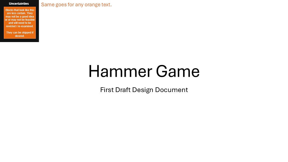
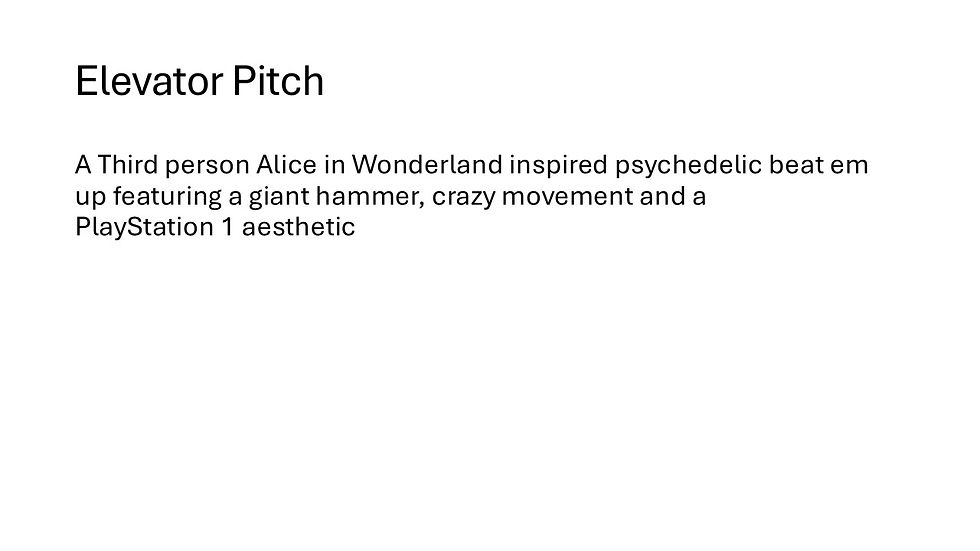
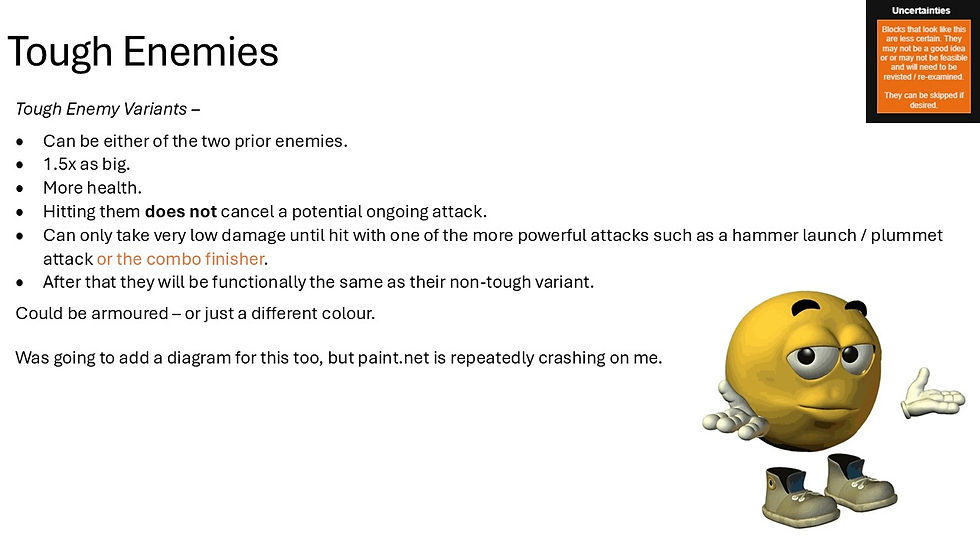
Click the Left and Right Arrows to Scroll Through the Pages

LEVEL DESIGN
As a Level Designer on the project, I was responsible for the design of the tutorial. Before starting the level design process we discussed as a group of designers the philosophy for the level design, deciding to aim for a linear dungeon style approach with larger combat rooms, followed by simple platforming and hallways to break them up.
Working on the tutorial, it was essential that it was tightly designed to ensure that all player learned the necessary mechanics. This required working very closely with the environment designers to ensure that no set dressing allowed players to take advantage of exploits or skip sections of the tutorial.
You can see footage of the tutorial here, and design documentation below that.
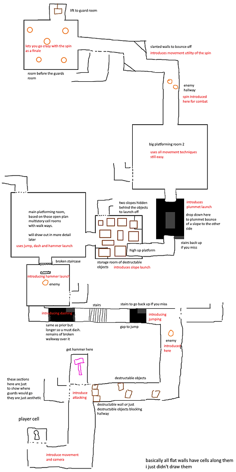
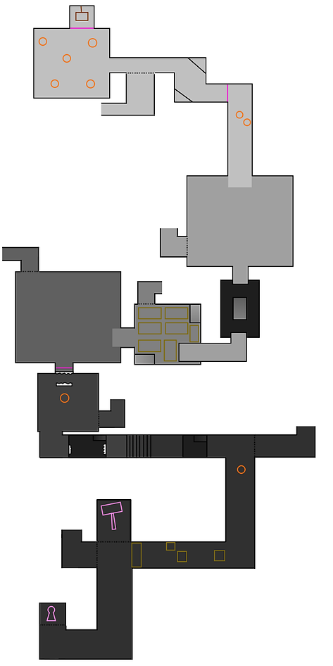
The style for design documentation was developed in tandem with the environment artists on our team. These images depict the tutorial seen in the image above.
The first image depicts the initial concept sketch drawn primarily for my own benefit, to allow me to map out the broad strokes of the level, focusing on the larger picture, not worrying about the minutia. It is much easier in this way, to consider the larger intended experience. The artists can use this as a base to begin conceptualising and preparing the aesthetic of the level.
The second image is a cleaner, more refined map, but focuses on the height of the level. The lighter the colours, the higher the section is. This helps to visualise the level in 3D and to further assist me in conceptualising the obstacles the player will face in each section.
On one ocassion an additional document was provided, which was a rough draw over, indicating certain essential aesthetic features.
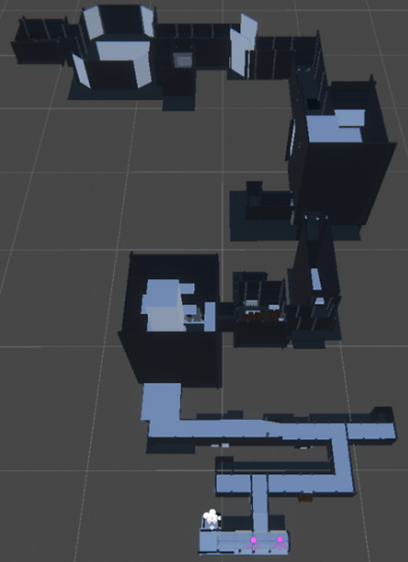
The third image is of the initial level blockout, made in ProBuilder following the dimensions/ratios (4x4) requested by the environment artists. This quick blockout allows for immediate testing, as almost all gameplay functionality is present, meaning we can begin to get and iterate on feedback right away.
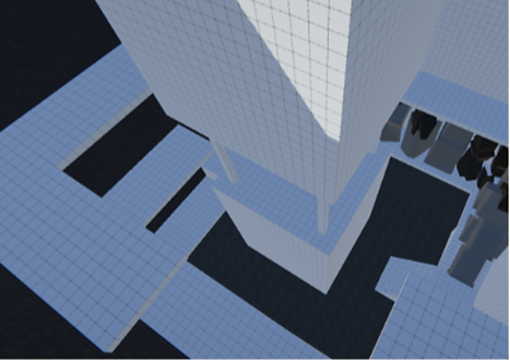
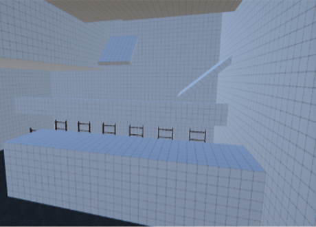
Closer look at the tutorial dungeon blockout.
This documentation shows how documentation was used to map out individual rooms. This is a top down view of a room, with multiple layers union skinned on top of each other.
Prototyping levels in documentation like this meant that, similarly to the larger scale maps, I could focus on the concept for the experience rather than the minutia and iterate quickly, since it was just simple coloured shapes, allowing me to fail fast.

Diagrams would also be made from a side view, using screenshots from the top down view when necessary for clarity.
Depending on the level design, either these side view or the top down diagrams would also be sketched over as seen in the rightmost diagram in order to consider different player actions and routes in depth.
Both of these diagrams could then be used as reference whilst blocking out an area, making the process far quicker.
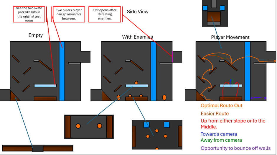
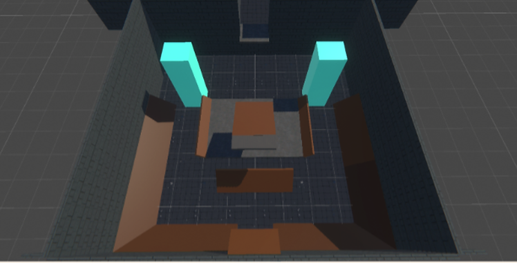
Image of the blockout resulting from the above diagrams.
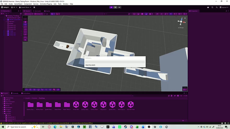
Gameplay of the blockout resulting from the above diagrams.
GALLERY


